
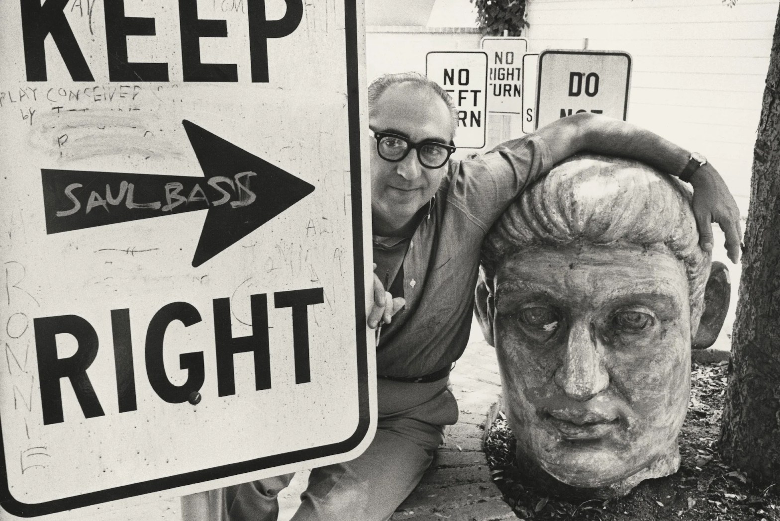
Makers & Rooms — Essay X
Saul Bass did not invent the film title sequence. He did something more consequential: he convinced Hollywood that the audience’s first minute and a half was not dead time to be tolerated but a work of art to be made. Everything that followed — in cinema, in corporate identity, in the visual culture of the second half of the twentieth century — bears his fingerprints.
By Bergotte
In 1954, a graphic designer from the Bronx walked into the office of Otto Preminger and proposed something that had not, in the thirty-odd years of sound cinema, been seriously attempted: a film title sequence designed as an integral part of the film itself, conceived as an opening statement of the work’s themes and emotional register rather than as a list of contractual obligations discharged as quickly as possible before the real thing began. Preminger, who was preparing to shoot Carmen Jones, listened. The sequence Bass designed — a stylised rose dissolving into flame against a stark white background, the credits appearing in a bold, unadorned typeface that was itself a statement — was, by the standards of what title sequences had previously been, a provocation. It was also, by any serious measure, a small masterpiece: seventy seconds of pure graphic thinking that told you, before a single actor appeared, exactly what kind of film you were about to see.
Saul Bass was thirty-four years old. He had been working as a graphic designer in Los Angeles since the late 1940s, producing advertising and promotional material for the film industry with a facility and a visual intelligence that had earned him a comfortable living but not yet the reputation that his talent warranted. Carmen Jones changed that. The sequence was noticed — by critics, by other directors, by the industry’s growing awareness that graphic design was a discipline with something specific and valuable to contribute to the visual arts. Within a year, Bass had been approached by Alfred Hitchcock, the most commercially significant director in Hollywood, who wanted him to design the titles for The Trouble with Harry. Within two years he was working on Vertigo. Within three, on North by Northwest and Anatomy of a Murder. Within four, on Psycho.
The list of films whose title sequences Bass designed between 1954 and his death in 1996 constitutes an inventory of a significant portion of the twentieth century’s most important cinema. Hitchcock, Preminger, Billy Wilder, Stanley Kubrick, Martin Scorsese — the directors who sought him out were, by and large, the directors who understood that a film began before the first scene, that the audience’s experience of a work started the moment the lights went down, and that the seventy or ninety or hundred and twenty seconds of the title sequence were not waste but opportunity. Bass understood this better than anyone, and the sequences he designed were not merely well-designed in the professional sense of being competent and appropriate. They were arguments — about the film, about cinema, about what visual communication could do when it was freed from the obligation to illustrate and allowed to speak directly to the emotions and the body rather than to the interpreting mind.
The Bronx, 1920
Saul Bass was born on 8 May 1920 in the Bronx, New York, the son of Jewish immigrants from Eastern Europe. The Bronx of his childhood was a borough of concentrated immigrant energy — densely populated, economically strained, culturally vivid in the way that places become culturally vivid when large numbers of people with different backgrounds and traditions are pressed together by circumstance and necessity. It was a world of visual abundance: shop signs in multiple languages, pushcart vendors, the graphic intensity of the street, the cheap but exuberant printed ephemera — posters, flyers, handbills — that constituted the visual communication of a pre-television commercial culture.
He studied at James Monroe High School, where a teacher whose name the historical record has not preserved recognised something in his drawing and encouraged it, and later at the Art Students League in Manhattan, where he encountered the formal discipline of art education without the institutional heaviness of the major art schools. He came to graphic design — still a young discipline in the 1930s, still finding its vocabulary and its ambitions — through a combination of natural visual intelligence, the influence of the European modernist emigres who had fled to America ahead of the war and brought with them the formal lessons of the Bauhaus and the Swiss school, and the practical reality that graphic design in mid-century America was one of the few fields where visual intelligence could earn a living.
He moved to Los Angeles in 1946, in the great westward drift of the postwar years, and established himself there as a designer and art director — working on advertising campaigns, posters, and promotional materials for the film industry that had made the city its capital. Los Angeles in the late 1940s was a city of aggressive visual salesmanship: the film studios competed for attention with the full resources of the graphic arts, and the designers who served them were required to produce work of sufficient impact to cut through the noise of a very noisy commercial landscape. Bass was good at this, and he would have had a perfectly respectable career doing it. But the Carmen Jones sequence changed the terms of what he was doing, and he did not go back.
The Title Sequence as Form
To understand what Bass did with the title sequence, it is necessary to understand what the title sequence had previously been. Before Bass, title sequences were, with rare exceptions, purely functional: a series of cards or crawling text listing the film’s title, its stars, its director, its producer, and the apparently inexhaustible variety of craft contributors whose union contracts required their acknowledgement. The design of these sequences was perfunctory — the studio’s standard typeface, the studio’s standard layout, sometimes a still image from the film or a generic illustration, occasionally a musical theme that established a mood without doing much to sustain it. The sequence existed to discharge obligations. The audience waited for it to be over. No one thought to question whether this was the only possible approach.
Bass questioned it. His fundamental insight — deceptively simple, productively inexhaustible — was that the title sequence occupied a unique position in the audience’s experience of a film: it was the threshold, the moment of transition between the everyday world outside the cinema and the imagined world of the film, and the quality of that transition shaped everything that followed. A perfunctory title sequence primed the audience for a perfunctory experience. A title sequence that worked on the audience’s emotions and imagination — that introduced, through image and movement and music, the emotional register of the film they were about to see — prepared them for a different and richer kind of engagement. The title sequence, properly conceived, was not preamble. It was the beginning.
The formal language Bass developed to make this argument was rooted in the graphic modernism of the European tradition but arrived at something distinctly American in its energy and its directness. He worked in flat areas of colour, hard-edged shapes, bold typography — the formal vocabulary of the Bauhaus translated through the commercial intensity of American visual culture into something faster and more visceral than its European origins. His shapes were not merely abstract. They carried emotional weight: the fractured, disjointed forms of the Anatomy of a Murder sequence communicated moral ambiguity before a word of the film had been spoken. The spirals of Vertigo induced, in the viewer’s eye and body, something physically adjacent to the vertiginous disorientation the film was about. The severed arm that snakes across the screen in The Man with the Golden Arm — a sequence Bass designed before the film itself, which Preminger then used to sell the project to a sceptical studio — communicated the grip of heroin addiction with a visceral economy that no amount of realistic footage could have matched.
This economy — the capacity to communicate complex emotional and psychological content through the simplest possible visual means — is the quality that distinguishes Bass’s best work from the merely competent graphic design of his period. It is not a quality that can be achieved by technical skill alone. It requires a form of visual thinking that is closer to poetry than to illustration: the identification of the essential image, the one shape or movement or colour relationship that contains, in concentrated form, the entire emotional content of what needs to be said. Bass found these images consistently, across fifty years of practice, with a reliability that suggests not luck or inspiration but a deeply trained capacity for visual reduction — for stripping away everything that was not essential until what remained was exactly sufficient.
Hitchcock and the Collaboration
The relationship between Saul Bass and Alfred Hitchcock was the most significant creative collaboration of Bass’s career, and it raises questions about the nature of creative collaboration that neither participant entirely resolved. Between 1955 and 1960, Bass designed the title sequences for five Hitchcock films — The Trouble with Harry, Vertigo, North by Northwest, Psycho, and Spartacus — and in at least one of those cases the relationship went significantly beyond title design into the film itself.
The shower scene in Psycho — one of the most analysed sequences in the history of cinema, the subject of dissertations and books and endless critical debate — has a title credit that reads: Pictorial Consultant: Saul Bass. The storyboards for the sequence, in Bass’s hand, are extant. The extent of his contribution to the sequence as filmed has been contested — Bass claimed a significant creative role, Hitchcock’s estate and some scholars have disputed this — and the dispute has never been definitively resolved. What is clear is that Bass was involved in the visual conception of the sequence at a level beyond what pictorial consultant conventionally implies, and that the sequence, in its graphic intensity and its formal economy, bears a strong family resemblance to his title work. Whether this constitutes authorship in any meaningful sense is a question that the historical record cannot settle and that the concept of film authorship, with its focus on the director as the single controlling intelligence, is not well equipped to ask.
The Vertigo titles are the purest expression of what the Bass-Hitchcock collaboration achieved. Designed with the mathematical assistance of the animator John Whitney, who had been developing computational techniques for generating complex geometric patterns, they open on a close-up of a woman’s face — her lips, her eye — and then spiral outward from the iris into a series of hypnotic geometric forms that seem to emerge from within the eye itself, as though the film’s imagery were a projection of the character’s inner world rather than an external reality. The sequence is, in retrospect, a perfect summary of what Hitchcock’s film is about: the instability of identity, the vertiginous terror of obsession, the way that looking — at a person, at an image, at a remembered face — can become a form of vertigo. That this summary precedes the film, that it prepares the audience for an experience they have not yet had, is the formal achievement that Bass never surpassed and that few title designers have approached since.
The Corporate Turn
Alongside his film work, and running through it as a parallel stream of practice, Bass was one of the defining figures in the development of American corporate identity design. The logos he produced — for AT&T, for Quaker Oats, for United Airlines, for Minolta, for Continental Airlines, for Warner Communications — are among the most recognisable visual marks in the history of American commerce, and they represent, taken together, a sustained argument about what a corporate identity could and should be.
The corporate identity programme — the systematic visual organisation of a company’s communications around a unified set of graphic elements — was, in the 1950s and 1960s, a relatively new discipline. The major American corporations were beginning to understand that the visual presentation of their identity across all their communications — from their letterheads to their aircraft to their advertising to their buildings — had commercial and cultural consequences, and they were beginning to hire designers to rationalise it. Bass was among the first designers of genuine artistic intelligence to work in this field at scale, and the logos he produced reflected the same formal intelligence as his film work: the same commitment to reduction, to the identification of the essential visual idea, to the communication of complex meaning through the simplest possible means.
The AT&T globe — a striped sphere suggesting the world, the network, the transmission of information across distance — is the most enduring of his corporate marks, and it has lasted, in modified forms, through decades of corporate transformation, because its underlying idea is strong enough to survive the changes in rendering and application that corporate evolution requires. A strong logo is not merely a distinctive mark. It is a visual idea that can be stated in a single colour, at any scale from a business card to a billboard, and that communicates its essential content in the fraction of a second that constitutes the practical attention span of a person encountering a corporate identity in the course of ordinary life. Bass understood this requirement at a level that most graphic designers of his generation did not, and the logos that met this requirement most fully have proven, by the ultimate test of survival in commercial use, to be as durable as any work of graphic art produced in the twentieth century.
The Poster and the Art of the Argument
The film poster, in Bass’s hands, became something that it had rarely been before and has rarely been since: a work of genuine graphic art that stood independently of the film it promoted while simultaneously preparing the audience for the film’s emotional and visual experience. His posters for Preminger’s films in particular — Anatomy of a Murder, The Man with the Golden Arm, Exodus, Bonjour Tristesse — are collected, exhibited, and reproduced as independent works, valued for qualities that exist entirely apart from their commercial function.
The Anatomy of a Murder poster — a stylised black silhouette of a dismembered body, its parts separated and slightly displaced, against a white ground — communicated, in a single image, the film’s theme of moral and legal fragmentation with an economy that the film itself, at two hours and forty minutes, could only approximate. The image was controversial: the studio was nervous, the exhibitors were uncertain, and there were voices in the industry that questioned whether a poster this stark could sell a film to a mass audience. It could. It did. And it established, for the generation of graphic designers who came of age looking at it, that the poster’s obligation was not to reassure the audience but to intrigue them — not to summarise the film but to create, in a single image, the desire to see it.
Bass’s posters worked on this principle consistently. They did not show scenes from the film. They did not reproduce the faces of the stars. They presented, in graphic form, the emotional or thematic core of the work — the idea beneath the story — and trusted the audience to respond to the idea rather than to the promise of recognisable faces and familiar situations. This trust was, in the context of Hollywood commercial design, radical. It was also commercially vindicated, which gave Bass the authority to continue making work that treated the audience as capable of responding to genuine visual intelligence rather than merely to the reassurance of the familiar.
The Late Return
Bass’s involvement with film title design diminished in the 1970s and 1980s — a period in which the corporate identity work occupied more of his practice, and in which the film industry’s relationship with graphic design became, in general, less adventurous. The title sequences of the 1970s were, with significant exceptions, less formally ambitious than those of the previous decade: longer, more illustrative, more inclined to the kind of narrative preamble that Bass had specifically opposed. The formal economy of the 1950s sequences was replaced by something more self-consciously cinematic, more interested in establishing the world of the film through extended imagery than in distilling its emotional essence into a concentrated graphic statement.
Bass returned to title design in the late 1980s, invited back by a new generation of directors who had grown up watching his sequences and who wanted, for their own films, something with the same quality of visual intelligence. Martin Scorsese was the most significant of these: the titles Bass designed for Goodfellas, Cape Fear, The Age of Innocence, and Casino brought him back to film work in his seventies and produced sequences that were, in their formal assurance, entirely continuous with the work of the 1950s. The Cape Fear titles in particular — a sequence of abstract images in deep red and black, reflections and distortions that suggested water and menace and the instability of the visible world — were as formally intense as anything Bass had produced in his prime. The forty years between Carmen Jones and Cape Fear had not softened the intelligence. They had, if anything, concentrated it.
He died in April 1996, in Los Angeles, at the age of seventy-five. He had been working until close to the end — the Casino titles were released in 1995, the year before his death — and the practice he had built with his wife and collaborator Elaine Bass continued after him for a period, completing projects that were in development. Elaine Bass, whose contribution to the work had been significant and consistently under-credited in the way that wives’ contributions to their husbands’ practices tend to be under-credited, continued to advocate for the work and for its proper historical recognition.
The Visual Grammar He Left Behind
The influence of Saul Bass on the visual culture of the second half of the twentieth century is, at this point, so thoroughly absorbed into the culture that it has become difficult to see. The formal vocabulary he developed — the flat graphic shapes, the bold sans-serif typography, the use of animation and movement to give graphic ideas temporal dimension — is now the common language of motion graphics, of broadcast design, of the digital visual culture that has absorbed and extended everything that preceded it. Design students who have never heard his name are working in a vocabulary that he did more than almost anyone to create. This is, in one sense, the highest form of influence: the kind that disappears into the general culture and becomes available to everyone without attribution. It is also, in another sense, a form of invisibility that his reputation has struggled against.
The struggle is less urgent now than it was twenty years ago. The critical rehabilitation of his film work — the retrospectives, the monographs, the renewed interest in the sequences as independent works of graphic art — has established his canonical status in the design world with a thoroughness that was not always apparent during his lifetime. The sequences are now shown in film schools and design schools and museums, analysed with the same seriousness that is applied to the films they preceded. The posters are in collections. The logos endure in daily use. The argument he made — that graphic design was a serious discipline capable of serious artistic achievement, that the visual intelligence required to design a corporate identity or a film title was not lesser than the intelligence required to paint a picture or write a poem — has been largely won, though the winning has been slow and incomplete and is still ongoing in the institutions that matter most.
What Bass demonstrated, across fifty years of practice in film and in corporate design and in the broader visual culture of American commercial life, was that the designed image — the image made with specific communicative intent, constrained by the requirements of reproduction and recognition and the abbreviated attention of a mass audience — was not a compromised form of art but a distinct one, with its own demands and its own possibilities. The demands were real: economy, clarity, legibility at scale and at speed, the capacity to communicate across the heterogeneous audiences of a commercial culture without losing the precision that distinguishes genuine visual thinking from visual noise. The possibilities were correspondingly real: an image that met these demands fully could reach more people more directly than any gallery painting, could embed itself in the visual memory of a culture in ways that fine art rarely managed, could speak — in the seventy seconds of a title sequence or the single image of a poster — with a directness and an emotional force that the more elaborated forms of visual art sometimes struggled to match.
The lights go down. The screen fills with a woman’s face, a spiralling eye, a geometric form that seems to emerge from within the iris and expand toward the audience. The film has begun, though no one has yet spoken and no story has yet started. This is the gift Saul Bass gave cinema: the understanding that beginning is itself an art, that the first image is the promise of everything that follows, and that the promise, if it is made well enough, is already the thing itself.
Discover more from My World of Interiors
Subscribe to get the latest posts sent to your email.

